
Five easily solvable UX problems in Pokémon Let’s Go
Pokémon Let’s Go Pikachu & Evee is the adaptation of Pokémon Yellow from the Gameboy Color.
It is available on the Nintendo Switch since late 2018 and features a lot of mechanics from Pokémon Go, for this article I’ll assume this was done partly as a way to interest mobile players to try the console version and vice versa. I played it around April 2019 on the Let’s Go Pikachu version.
![]()
![]()
Changing the gameplay like this is a challenge but also an opportunity to change some interactions and make the game even more accessible … or not.
Here are 5 problems in Pokémon Let’s Go that shouldn’t be there and are easily solvable.
Some of them may look like problems of little interest and players can still play and enjoy the game, but they are also easy to find, easy to fix problems. They are not big game breaking problems, more of the tiny, omnipresent, irritating kind. It’s a shame that they slept through the net, at least some playtests could have helped discovering them. So please, do User Tests ! They are useful I swear.
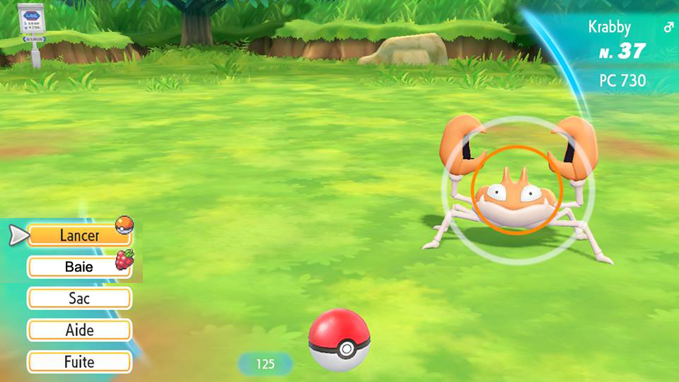
Using berries is tedious
When you encounter a pokémon, you can throw pokéballs at it to try to catch it, but you can also throw a berry to ease the capture.
 The interface for throwing pokéballs is pretty simple and inspired by the one in Pokémon GO : You just have to select “throw” and push a button or make a throwing gesture to launch the pokéball. (You also have to aim, which could be easier in hand held mode if there was a pointer at the center of the screen but as it would differ depending on the setup I’ll ignore this problem here)
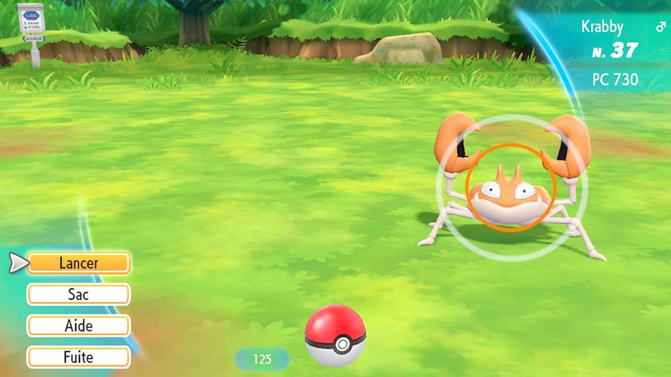
You can also give the Pokémon a berry to ease the capture, but to do so, you have to :
- Select “bag” in the menu
- Move the cursor on the berry
- Select it
- Select “use”
- Select “use” again to give it.
Then you can throw the pokéball, and if the capture fails, the berry effect will were off, so you will have to do it all again after each pokéball throw !!
 This is a really tedious process that differs a lot from Pokémon GO and can dissuade from using the berries pretty quickly.
Balls and Berries are the only two items types that you can use while capturing, making them so different to use while encouraging to use them one after the other is not a good move.
 I suppose using a unused button on the controller would not work with the “pokéball plus” controller so I’ll suggest another solution.
You can add a “berry” button under the “launch” button, that would use the last berry selected in the bag if pressed.
Mockup: Adding a “berry” button and which item will be used if interacted with.
You could even take more inspirations from Pokémon GO and add the selection of the pokéball and berry directly in the first menu. For example, going left or right to select a different ball or berry before throwing it (it could be difficult for the “pokéball plus” users because the button is on the joystick but making the left or right input so you’d have to move the joystick all the way could help solve that)
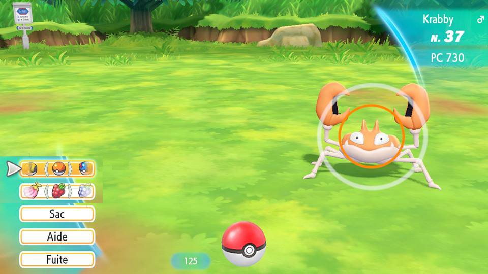
Mockup: Adding a “berry” button and a mean to change what item to throw without using the bag.
The capture circle can be confusing
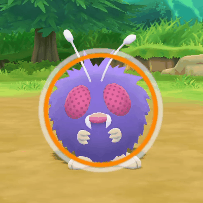
When you try to capture a pokémon, there is a shrinking circle on the pokémon that you have to aim at to make a “nice”, “great” or “excellent” throw depending on the circle’s size, the littler the circle, the easier the capture.
This looks like Pokémon Go but the circle’s size to reach each level of throw differs from one game to another. For example, in Pokémon Go, when the pokéball hit inside the circle at its biggest, the throw is “nice” but in Pokémon Let’s Go the circle needs to be smaller.
A nice throw in Pokémon Go and the same throw in Pokémon Let’s Go
Pokémon Let’s Go takes the capture experience exclusively from Pokémon Go, using the exact same rules for how to do a “nice” throw could have been less annoying for Pokémon Go players (a good part of the target audience) to understand.
When selecting a berry, the circle stays on the Pokémon but is useless, you don’t have to aim your berry throws. Besides, the circle’s color (green for easy, yellow for not so easy, orange for hard, red for very hard) changes as if you were holding a basic pokéball.
For example, in the video below, I want to capture a big Pokémon with my great ball, the circle is orange, I select a berry and the circle turns red (☹ “What? Is it more difficult? This doesn’t please me!”), then I throw the berry and the circle turns yellow to reflect the actual difficulty.
Just make the circle disappear while a berry is selected … like in Pokémon Go.
Secret Techniques don’t need a whole screen
There is no more HM’s, to progress in the game your partner will learn Secret Techniques like “Chop down” to cut little trees on the way or “Sea Skim” to surf on water. They are listed in a screen when selecting your partner’s head in the main menu then selecting “Secret techniques”.

All of these techniques can be used when interacting with the environment (a tree, the sea, when entering a cave …) except one: “Sky Dash” which allows to fast travel to previously visited cities. This means that the only use of the “Secret Techniques” screen is to see which techniques you have unlocked (so one or two uses for the entire game) and use “Sky Dash” (every five minutes at the end game).
Sky dash could be directly on the main menu when you unlock it to make it easier to travel.
The “Secret techniques” could also be directly on the partner screen so you could see which one you unlocked without having to go inside a submenu, this screen would then mainly be used to start playing with your partner.
Mockup: Adding “Sky dash” to the main menu after it is unlocked.
Attacks details VS Attacks selection
During a battle or on the pokémon’s information screen, when selecting an attack, you navigate between them with up and down but you can also see their details (damage, precision, effect …) by pressing a button. You can then navigate between the attacks with left and right.
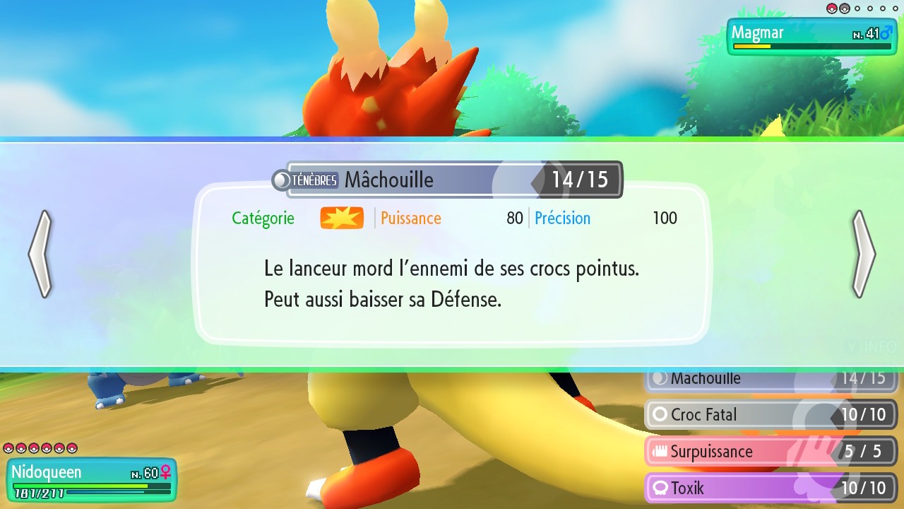
This can make it confusing to navigate the two menu’s “Versions” (☹ “Wait, where do I go to see the attack that was over this one? Left or right?”) and adding a whole overlay seems a bit too much for the amount of information presented on the details.
By applying some simple mapping principles, just making the navigation in the details up and down could help a lot. You can even make the details appear as a tooltip to accentuate the link between them and the attack list.
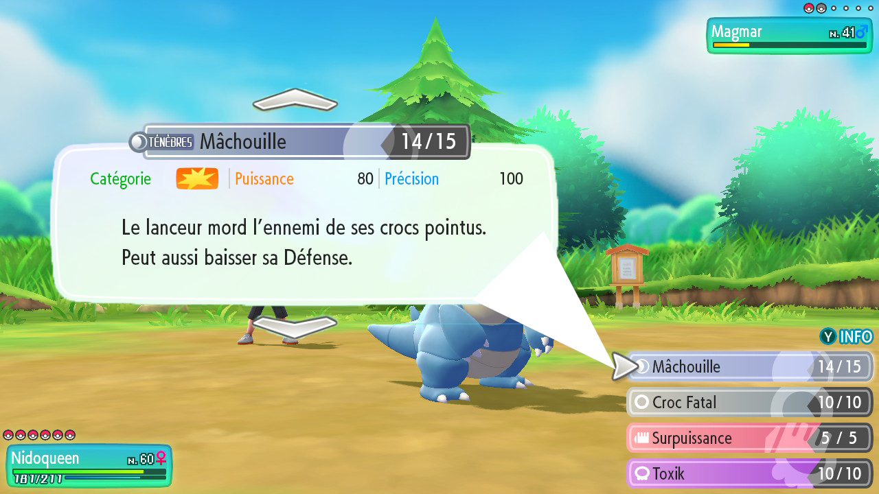
Mockup: Making the navigation in the details “up and down” and making it look like a tooltip. (With this visuals we can even get rid of the arrows because the navigation in the attacks is still shown).
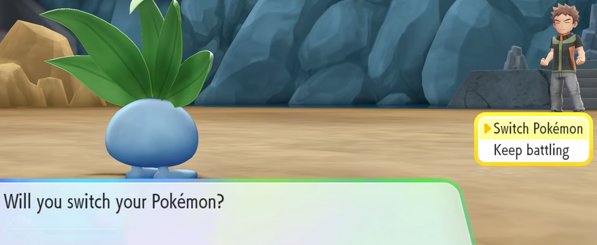
Text Box “will you switch Pokémon”: Why is it still a problem ?
In any Pokémon game, when you beat a trainer’s Pokémon and they have another one, the game warns you about which pokémon will be arriving and leaves you the choice to switch your pokémon before the new one arrives, but you have to make the choice on a screen with no information about which Pokémon will arrive. You had to pay attention when the game told you (even if it is after 3 of your pokémons leveled up so you were mashing “A” for the text to go faster … and you just missed it!).
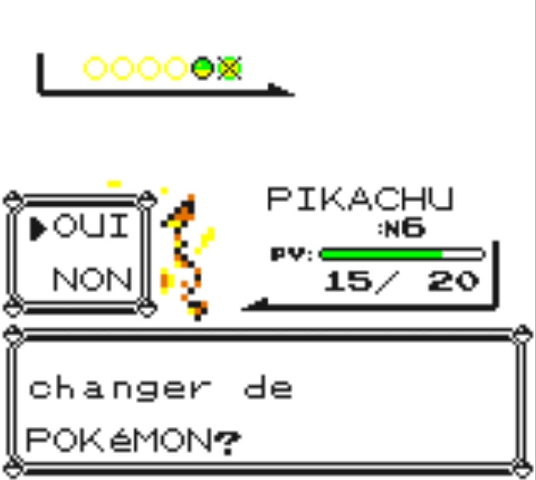
This is a problem that’s been around since the first Pokémon games, more than 20 years ago, and it is somehow worse in Pokémon Let’s Go!
In Pokémon Let’s Go, this text box hides your Pokémon’s lifebar!
“Wait! Which one did they say? Is my Pokémon hurt?”
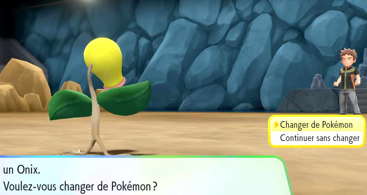
In the French version, the translators seemed to take pity on us and the next Pokémon stays on screen
When presented with a choice with no time limit, the players can and will take the time to ask themselves basic questions like “What will happen?”, “What is my status?”, “What can I do?” … If the essential information that is usually always on screen is hidden just when it can be of use this is just mean and doesn’t add any value to the experience (Well, maybe in a puzzle game but definitely not in Pokémon).
You can make the next Pokémon’s name stay on screen and move the “status box” over the text box. Or you can add an indication about the next Pokémon to arrive.

Mockup: Adding the lifebar over the text box and show the next pokémon to be called by the opponent
Conclusion
These weren’t the only problems in Pokémon Let’s Go (I could have added the sorting of pokémons in the huge box, the creepy look your pokémon gives you when you use a super effective attack or even the fact that everyone in Celadon city talks about how the Game Corner’s games are great but you can’t play any of them …). These are problems that you can’t always express as a Pokémon games player. These are problems that will damage your enjoyment of the game, even without you noticing.
As an UX expert, a good part of my playthrough was sprinkled by “Why would they do this? Are they blind or was it planned by someone evil in the dev team? Would this be acceptable if it were a brand new game?”
Maybe these were problems deemed “less important” than others in the end of the development cycle and were ignored to work on bigger ones, maybe it was hard to record “fanboyless” reactions from players during playtests, knowing that Pokémon is this massive beloved franchise. But even then, you have to try to understand the game from the eyes of your target audience, and if you can’t, we are here 😉.